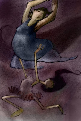
I'm doing some character designs for Concept Design, and this is some stuff I did over the weekend.
This class is proving to be a fun challenge...
Comments/ critiques always welcomed.
Cristian.
Monday, April 25, 2011
Tuesday, April 19, 2011
Photoshop paintings
This is one of 3 "warm-up" paintings I did today; the other two were lost due to my extreme lack of foresight (quit without saving). I say "warm-up" because although they were quick 10-min sketches, I wasn't really warming up to anything. Just killing time between classes.
As with other warm-ups, I tried to limit my time doing these, as I tend to get distracted sometimes, or I get too detail oriented and obsess about shades of color.
Of the three, I think this rates second-best. Or second-worst, depending on your outlook?
This second, because I was tired of painting landscapes, was a random patron of my school's computer lab.
He caught me eying him one time and gave me a "bitch I CUT YOU!" look. O.o
I didn't quite finish the image (too busy running for my life), and now that I'm away from the Cintiq, I really hesitate to try. The color fidelity on my laptop screen is so inferior, I don't want to make any color choices. Everything looks too desaturated, whereas on my school's Cintiq, every color was warm, vibrant and alive.
. . . . I miss the Cintiq, you guys. =/
-- Cristian
Saturday, April 16, 2011
Warm-up for April 16, 2011
Instead of the usual sketching, I decided to do a watercolor painting today. I gave myself 90 minutes (I usually take 25), but because some hooligan put my iPod timer on "sleep" instead of "puppies barking" (okay, it was me), I have no idea how long this actually took. Could've been an hour and a half, could'be been two. I wasn't paying that much attention to the clock; just painting, and the cool, sultry sound of Biggie Smalls laying down some "phat beats", as the kids say.
Regardless, I kinda like it. It doesn't look like the source image, and there are glaring errors that scream out at me like the cries of a thousand restless dead, but if I squint hard enough, it looks okay.
I think my technique needs work. This was mostly done by laying down color, waiting for a short while, then picking up the water and pigment with a napkin. Worked well enough, I suppose, but it has its drawbacks. I just need to experiment more, I guess.
-- Cristian
PS -- Firefox recognized "phat" as a word. Surely this heralds the coming apocalypse.
Big Ol' Dump o' sketches
It's occurred to me that I mostly just post school work here, so here are some miscellaneous sketches I've done, either as warm-ups (really, just Thor & Spider-Man, since I only just started warm-ups), or killing time on the bus to school, or . . . in class.
Warm-up for April-15. Don't like it. The anatomy is too wonky.
Likewise the 14th's warm-up. Clearly, I need to revisit the anatomy of the human arm. =/
Couple of head sketches for a concept design class, designing Captain Shakespeare from Neil Gaiman's Stardust.
From the same movie, Yvaine.
And Tristan. These are all quick(-ish) studies, and probably nothing close to what the final outcome will be.
Went sketching at the Portland Museum of Art.
They had an original Alphonse Mucha. That was pretty cool. =P
A "bored in class" sketch.
People on the Bus. I do this often enough that I'm thinking I should create labels specifically for these sketches.
I call this guy Mexican Elvis.
The first two sketches here are of the same person; this guy looked like the grizzled ol' sea captain who calls everyone a pansy when it comes time to go after a killer shark, then dies gruesomely in the third act. Except that he was wearing a cowboy hat and leather. So... land... shark? <=/ Maybe not.
Quick sketches of the main character of a work-in-progress.
In-class sketches while people gave nervous presentations on key figures in the field of psychology. (I did Carl Jung, and was the most nervous of them all.)
Sketching in public.
I'm still not great at drawing interesting poses without a model, so I practiced some here.
Random girl in class, and random image from some random thought. I like the second drawing. It's not usually not my style (whatever that may be), but it works.
And lastly, a dragon. Cause I'm a nerrrrrrrrrd. :}P
That's (mostly) all for now, but I have these kinds of sketches spread out over a few sketchbook, so there will probably be more.
-- Cristian.
Warm-up for April-15. Don't like it. The anatomy is too wonky.
Likewise the 14th's warm-up. Clearly, I need to revisit the anatomy of the human arm. =/
Couple of head sketches for a concept design class, designing Captain Shakespeare from Neil Gaiman's Stardust.
From the same movie, Yvaine.
And Tristan. These are all quick(-ish) studies, and probably nothing close to what the final outcome will be.
Went sketching at the Portland Museum of Art.
They had an original Alphonse Mucha. That was pretty cool. =P
A "bored in class" sketch.
People on the Bus. I do this often enough that I'm thinking I should create labels specifically for these sketches.
I call this guy Mexican Elvis.
The first two sketches here are of the same person; this guy looked like the grizzled ol' sea captain who calls everyone a pansy when it comes time to go after a killer shark, then dies gruesomely in the third act. Except that he was wearing a cowboy hat and leather. So... land... shark? <=/ Maybe not.
Quick sketches of the main character of a work-in-progress.
In-class sketches while people gave nervous presentations on key figures in the field of psychology. (I did Carl Jung, and was the most nervous of them all.)
Sketching in public.
I'm still not great at drawing interesting poses without a model, so I practiced some here.
Random girl in class, and random image from some random thought. I like the second drawing. It's not usually not my style (whatever that may be), but it works.
And lastly, a dragon. Cause I'm a nerrrrrrrrrd. :}P
That's (mostly) all for now, but I have these kinds of sketches spread out over a few sketchbook, so there will probably be more.
-- Cristian.
Wednesday, April 13, 2011
Warm-Ups for Apr. 13, 2011
I don't usually do this, but today I decided to do a couple of warm-up sketches before getting started on animation homework. I arbitrarily chose a male angel (I usually do females) and Iron Man. I must've had one funky dream I can't recall, because these two were on my mind almost since I woke up.
Anyway.
Because I tend to get distracted and focus too long on one image (which leads to overworking, and can be detrimental to the final product), I gave myself 25 minutes per sketch.
The angel turned out . . . I don't know. I like it, but it could be better. I think he could be further away, to really get a sense of those wings I didn't end up finishing. =/
(That's not a 5 o'clock shadow, by the way; his eyes and wings were supposed to glow, and I just ran out of time.)
I like this Iron Man sketch a lot better. There's more action, I think, and more anticipation. Chris Sanders says that even the quickest, looses sketch should "attend to story", and I think you can definitely tell IM is up against some pretty big foes.
Or maybe I like it because it was done largely without reference. A 5-minute Google Image search didn't result in any pics of his back, which was originally the focus of the image, so I just made up most of it as I went. (Ultimately, I had to go back to GIS for a better sense of his face, which didn't do the job to begin with.)
That's all for now, but these were fun, and I'll try to keep it up.
-- Cristian
Saturday, April 2, 2011
Update
A new look at Tuesday's image, with fresh pencils and new colors laid out in Photoshop.
I rather like how the coloring came out. It has a colored-pencil/pastel look to it, with none of the hassle of working in the actual medium. And PS is a lot more forgiving, which is a huge draw as I just experiment with stuff.
As always, comments and critiques are welcome. :)
-- Cristian
I rather like how the coloring came out. It has a colored-pencil/pastel look to it, with none of the hassle of working in the actual medium. And PS is a lot more forgiving, which is a huge draw as I just experiment with stuff.
As always, comments and critiques are welcome. :)
-- Cristian
Subscribe to:
Posts (Atom)